Neat Tutorials
Give it a try for yourself »
- Using the ExtraContent Stack from Adam Merrifield on Vimeo.
- More here: http://foss.seydoggy.com/?p=ExtraContent
The following steps describe how to utilize the Social Icons within your project.
-
Insert the following code in the Sidebar or Footer area within RapidWeaver:
<ul class="major-icons"> <li><a href="#" class="icon fa-twitter"><span class="label">Twitter</span></a></li> <li><a href="#" class="icon fa-facebook"><span class="label">Facebook</span></a></li> <li><a href="#" class="icon fa-instagram"><span class="label">Instagram</span></a></li> <li><a href="#" class="icon fa-github"><span class="label">Github</span></a></li> <li><a href="#" class="icon fa-dribbble"><span class="label">Dribbble</span></a></li> <li><a href="#" class="icon fa-tumblr"><span class="label">Tumblr</span></a></li> </ul> - Replace the # with the page URL of your social icon.
- Replace the class value with the corresponding social nerwork name of the social icon of your choice.
- Highlight the entire code and click Clear Formatting, then Ignore Formatting under Format at the top left of your screen.
The following video describes how to add a banner image by utilizing the Resources section (requires RapidWeaver 7+) within RapidWeaver. https://www.rapidweavercommunity.com/tutorials/series/new-features-in-rapidweaver-7/episode/banner-images
The following steps describe how to add a slider to your project (requires RapidWeaver 6+) within RapidWeaver. You can see a demo of the slider in this page.
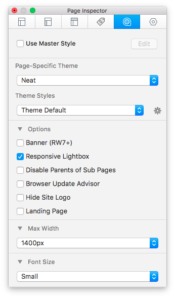
- Go to your Page Inspector > Styles and choose Banner Image > Hidden.
- Go to your Page Inspector > Styles and choose Banner Height > None.
-
Insert the following code in your page Content or Sidebar:
<div id="myExtraContent1"> <div class="wt-slider"> <div class="s-slide" style="background-image:url(%pathto(images/banners/banner_1.jpg)%)"> <div class="s-item"> <h1>Page built with Stacks.</h1> <p>Show includes a FREE Stack called "Gridly" that you can use to create pages like this!</p> <a href="#two" class="button scrolly">Learn More</a> </div> </div> <div class="s-slide" style="background-image:url(%pathto(images/banners/banner_1.jpg)%)"><div class="s-item"><h1>Slide 2</h1></div></div> <div class="s-slide" style="background-image:url(%pathto(images/banners/banner_1.jpg)%)"><div class="s-item"><h1>Slide 3</h1></div></div> <div class="s-slide" style="background-image:url(%pathto(images/banners/banner_1.jpg)%)"><div class="s-item"><h1>Slide 4</h1></div></div> <div class="s-slide" style="background-image:url(%pathto(images/banners/banner_1.jpg)%)"><div class="s-item"><h1>Slide 5</h1></div></div> </div> </div> - Highlight the entire code and click Clear Formatting, then Ignore Formatting under Format at the top left of your screen.
-
You can change the height of the Slider using this code in Page Inspector > CSS:
.s-slide { height: 450px }
One more nice and cool effect built-in, the ability to use slide effects triggered by scroll events.
To do that you will need to add some class's to the element you want to animate, one simple example would be something like this:
- Insert the following code in an HTML stack or anywhere that allows HTML:
<div id="myExtraContent1"> <div class="align-center wow fadeIn"> <h1>It's all about the <span>big hero</span> strapline.</h1> <p>But don't forget about your jazzy tag line!</p> <a href="#content" class="button big scrolly">Learn More</a> </div> </div> - You can see that I've added the class's named "wow" and "fadeIn" in the element above.
- The other options you can use are here. Just pick the one you want and your done.
Show Theme as some nice and cool effects built-in, an example is the ability to scroll when clicking on a link.
- Insert the following code in an HTML stack or anywhere that allows HTML:
<div id="myExtraContent1"> <div class="align-center wow fadeIn"> <h1>It's all about the <span>big hero</span> strapline.</h1> <p>But don't forget about your jazzy tag line!</p> <a href="#content" class="button big scrolly">Learn More</a> </div> </div> - Replace the ID value "#content" in the link href above with the name of the ID you need to scroll to and use the class name "scrolly" to enable the scroll effect on you page.
- Optional ExtraContent sections ID's are #two, #three, #four, #five and #six.
You can get the Toggle Stack for free: here, Thanks Will.